Flooded Folds
Game Type: 2.5D Isometric Puzzle Educational Adventure
Engine: Unity
Language: C# Scripting
Project Duration: 2 months
Team Size: 4 UF students, 2 KU Students
In this project, I took on multiple roles. I was the team lead, UX/UI designer, level designer, and systems programmer. My contributions helped design and build tutorial levels to introduce players to the game's mechanics, rework the programming to enhance gameplay, and polish the overall user experience.
With the help of Kyoto University students, Flooded Folds also educates the players about hazards to avoid during a flood disaster.
Play in-browser on our itch.io below!


As a team member of Flooded Folds, I worked as:
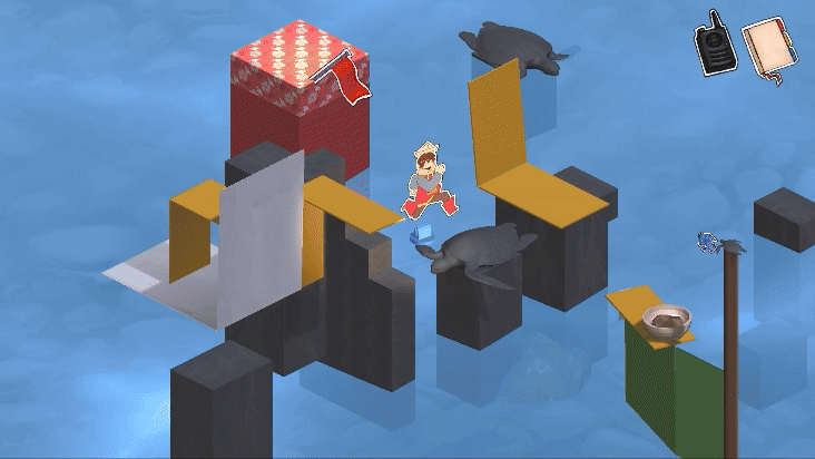
Gameplay Screenshots


Project Manager
What did I learn and overcome?
-
Risks and mitigating them: Our passionate team had many exciting, out-of-the-box ideas. Some of which were big risks. I learned to identify what became overscoped and communicated it to my team.
-
Saying difficult things: The team comprised of my friends and classmates. It was challenging and felt more tense when we disagreed due to our deep connections. However, we persevered and touched-base on a level where we could successfully achieve our project goals.
-
Language barrier: 2 of our students were from Kyoto University's graduate program. Since English wasn't their first language, I was able to overcome this barrier by using tools to help translate in English while learning phrases in Japanese.
Alpha Milestone Presentation

UX/UI Design
Static Elements- What stayed on screen
Scrapbook
3 pages to flip through:
-
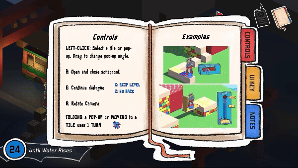
Controls: Basic player controls and GIF tutorials of tile movement and paperfold UI.
-
UI Key: Explains the UI elements the player sees on screen.
-
Notes: Info about evacuating a flood, QR code to a checklist, and dynamic tips from Radio-Man.
During development I used my personal scrapbook as a reference:
-
I even went to the Konbini (convenience store) and bought notebook tabs.
-
I put them in my scrapbook because I had trouble visualizing what the player would see when flipping to the next page.
Turn controller
In levels with the rising water mechanic:
-
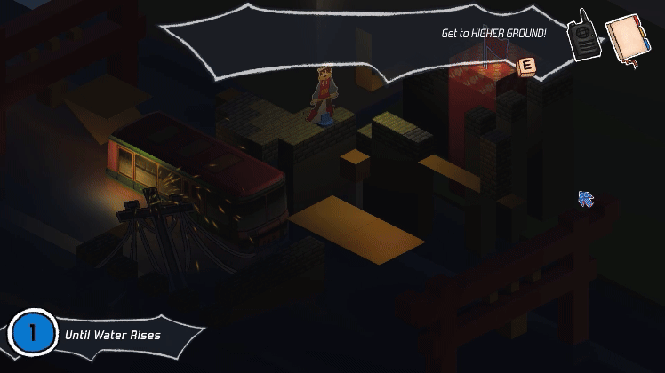
x Number of Turns: The player has x number of turns until the water rises.
-
Reused Asset: To design this, I reused the Dialogue UI asset and added a circle to cleanly display x number until water rises.
-
Visibility: The back sprite remained at 50% opacity for gameplay visibility, but the sprite holding the x number remained 100% opaque.
Previous UI:
-
Turns Till Area Floods: the term was too long of an explanation and took up a lot of space.
-
Broad/Inaccurate: It also didn't accurately explain our rising water mechanic in a concise way. "Area" felt broad and unclear.
 |  |  |
|---|


Slider UI for paperfolds that only fold from 180 to 90 degrees

Slider UI for paperfolds that fold from 180 to 90 to 20 degrees

Reusable Button UI assets
Slider UI for paperfolds that only fold from 180 to 90 degrees
Dynamic Elements- What appeared shortly
Dialogue
Final UI:
-
Visibility: Dropped opacity to 50%. Previous design was opaque and blocked gameplay.
-
Radio Sprite: In a flood, a radio is one of the emergency items a person needs during evacuation. Radio-Man became the informational narrator to educate the player about hazards that occur during a flood.
-
Back Panel: Solid color panel at 50% opacity. Drives the player's attention towards Radio-Man's Dialogue.
Previous UI:
-
Busy: A radio is loud and crackly. The first draft strongly demonstrated this through a geometric, sharp-edged style. As a team, we found it was too busy in-game.
-
Composition: Our team play tested our prototype and felt the dialogue interfered with the gameplay. The number of sharp-edges took up a lot of space on the screen. Likewise, there wasn't enough space for actual text. In the redesign, I referenced Dialogue UI from Persona 5, which had a loud element to it.
Buttons and Slider
Pause Menu:
-
Back Panel: Similar to the Dialogue UI, a colored panel at 50% opacity appears when the player pauses the game. This halts gameplay and emphasizes the options to continue gameplay, restart the level, or quit to main menu.
-
Reusable Design: Most UI button options reuse the same asset to improve cohesiveness. The goal was to keep the UI paper-like, which was successfully reached.
Slider Research:
-
Collaboration: With the Lead Illustrator and another Designer, together we researched paper-like gameplay UI. We made sure we were satisfied with clear design that followed our main aesthetic.
-
Output: Based on our team's collaboration on the design, I rendered and finalized a notched slider with an arrow that points to universal angle icons over a themed box sprite. The fold button reuses the same UI button option asset. It was important that we had two versions of the Slider for when the player is allowed to move it from

Level Design
5 Levels- 3 Tutorials, 2 Hazards
Process
Guideline Summary:
-
Goal: Design levels to use the folds in unique ways, keep levels short and sweet, with some that become slightly more complex, and let the player figure it out.
-
Spacing: If a space is unreachable, it should look unreachable to the player. Don't leave them confused if they can make the jump or not.
-
Paperfolds: Using presets to ensure levels are consistent and functional with player movement system.
Collaboration and Research:
-
Brainstorming: With my Co-Level Design Lead, we reworked the levels I had mockups of. We realized we didn't know how to make a puzzle platformer. Researching similar games helped redefine our goals and define our Level Design Document.
-
Captain Toad's Treasure Tracker (link): A rotating camera inspired us, affecting many level layouts. We recognized the levels in this reference were more concise with meaning to their design.
-
What Makes a Good Puzzle Game (link): A good puzzle game doesn't necessarily have long levels. It has a "catch" the player has to figure out.
Level Design Document
Tutorials
Level 1

First iteration of the tutorial level.

Final iteration of the tutorial level.
First iteration of the tutorial level.
Goal:
-
Introduce Rising Water: Here the player learns about our rising water system indicated by gameplay and the Until Water Rises UI.
Players make a decision:
-
Upper Path: Following the right upper path, the player succeeds and moves to the next level, indicated by dialogue from Radio-Man. In a flood, it is always encouraged to get to higher ground if possible.
-
Lower Path: Following the left lower path, the player drowns and restarts. The height at which a flood rises to is unpredictable, which is why taking higher ground is safer.
Level 3

First iteration of tutorial level 3. Needs to be shorter.

Final iteration of tutorial level 3. Shorter and introduces paperfolds.
First iteration of tutorial level 3. Needs to be shorter.
Goal:
-
Introduce Player Movement: Focused on letting the player understand how to move in game by clicking the tiles.
-
Introduce Red Flag: Indicates the end of every level. Within the context of a flood, it's known as the evacuation zone..
What changed?:
-
Bare-Minimum UI: Kept the UI basic and removed Player Turn Counter along with Turns Till Area Floods. It was important that the level introduced the core movement and nothing else to overcomplicate it.
-
No Paperfolds: In the Prototype, it features yellow paperfolds. However, this gameplay mechanic was moved to the 3rd Tutorial level to avoid overwhelming the player with information.
Level 2

Goal:
-
Introduce Paperfolds: Demonstrating the star of the show-- paperfolds! Each level uses paperfolds in a unique way. We introduce their appearance via color and sizes.
-
Introduce UI Slider: When the player clicks a paperfold, the UI Slider appears. This allows the player to experiment and change the angles of the paperfolds.
What changed?:
-
Length: The prototype was too long., which weren't within the guidelines of our LDD. I reassessed the level and removed unnecessary platforms and brought the remaining platforms closer together.
-
Paperfolds: In the prototype, the team wanted to keep the color white to resemble paper. When it came to playtesting, our peers couldn't tell what was a paperfold and what wasn't. Additionally, I recognized the large-sized paperfold did not follow the our LDD guidelines. It was updated to use the 5 x 5 size.
Hazards
Put it to the test:
-
Previous Knowledge: Players should already know how to move and navigate rising water with the goal of getting to higher ground.
-
Paths: Re-introduces multiple pathways to get to the flag (evacuation zone).
What changed?:
-
Busy: I received feedback from my co-designer and we worked together to use our LDD and restructure the level.
-
Paperfolds: The paperfolds were placed in locations that didn't follow our LDD guidelines. We want the player to use paperfolds in a unique way. Most in the prototype were simply unfold and walk-over types. Paperfolds that interact with the bus and have tiles on top of them added interest to the level.
-
Composition: Part of my responsibilities were to include the electricity hazard into this level. The composition didn't effectively support this, so I shifted focus towards a city-like level. I took inspiration from festivals I attended, including Gion Matsuri in Kyoto and the Tanabata Festival in Osaka.
 |  |
|---|---|
 |  |
 |  |
 |
Electricity Level
Rushing Water Level

First iteration of the rushing water level.

Second iteration of the rushing water level.

Image by Naoki Kuwamoto.
First iteration of the rushing water level.
Put it to the test:
-
Previous Knowledge: Since this is the last level in the game, players should comfortable with the rising water and movement systems. They should also already know by now that they need to figure out what the "catch" is for the level. In this case, it's diverting the water with the paperfolds and interacting with the buttons.
-
Hazard: Identifying a hazard type, rushing water.
What changed?:
-
Buttons: Added buttons, one that lets the player step on and another that creates an interesting relationship with paperfolds.
-
Navigation: The first draft featured a paperfold that catapults the player across the level. It was cut because it was too many mechanics and buttons already provided a unique element to the player's navigation.
-
Composition: When the player applies pressure to the buttons, the platform with paperfolds rise. The placement of platforms were readjusted to avoid the player from folding the paper to divert the water without any interaction with the button. This level took inspiration from my travels to Harborland Mosaic in Kobe.